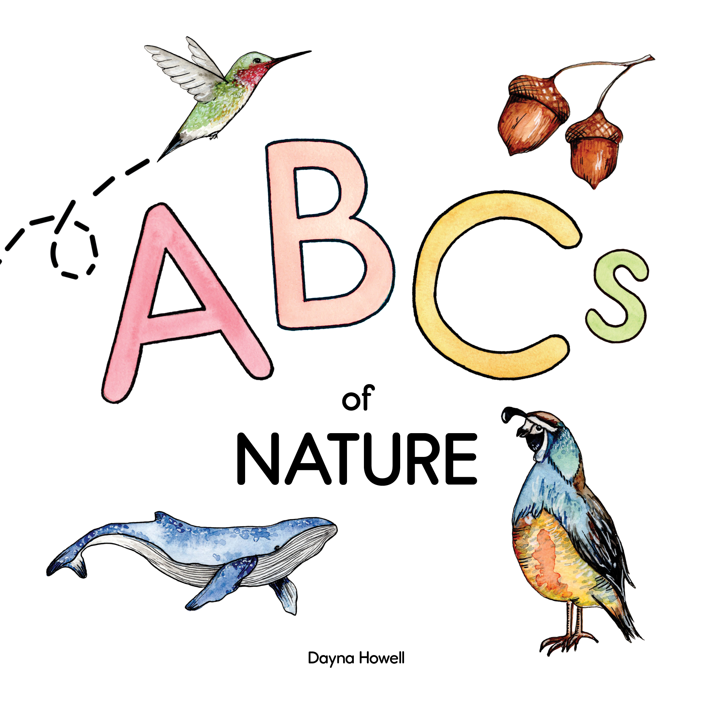
Children’s Nature Alphabet Book
Created for Typography 2 at Humber College, this children’s alphabet book inspired by nature combines simple and easy-to-read typography with vibrant watercolour illustrations. Flip through the complete book below!
Role: Art Director, Graphic Designer (Adobe Photoshop & InDesign) & Original Illustrations (Painting & Adobe Illustrator)
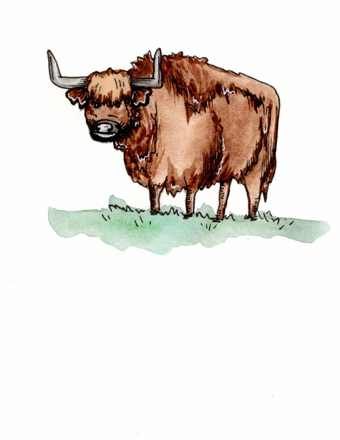
Materials: All illustrations were created by hand with watercolour paint and ink on 140lb watercolour paper

About This Design
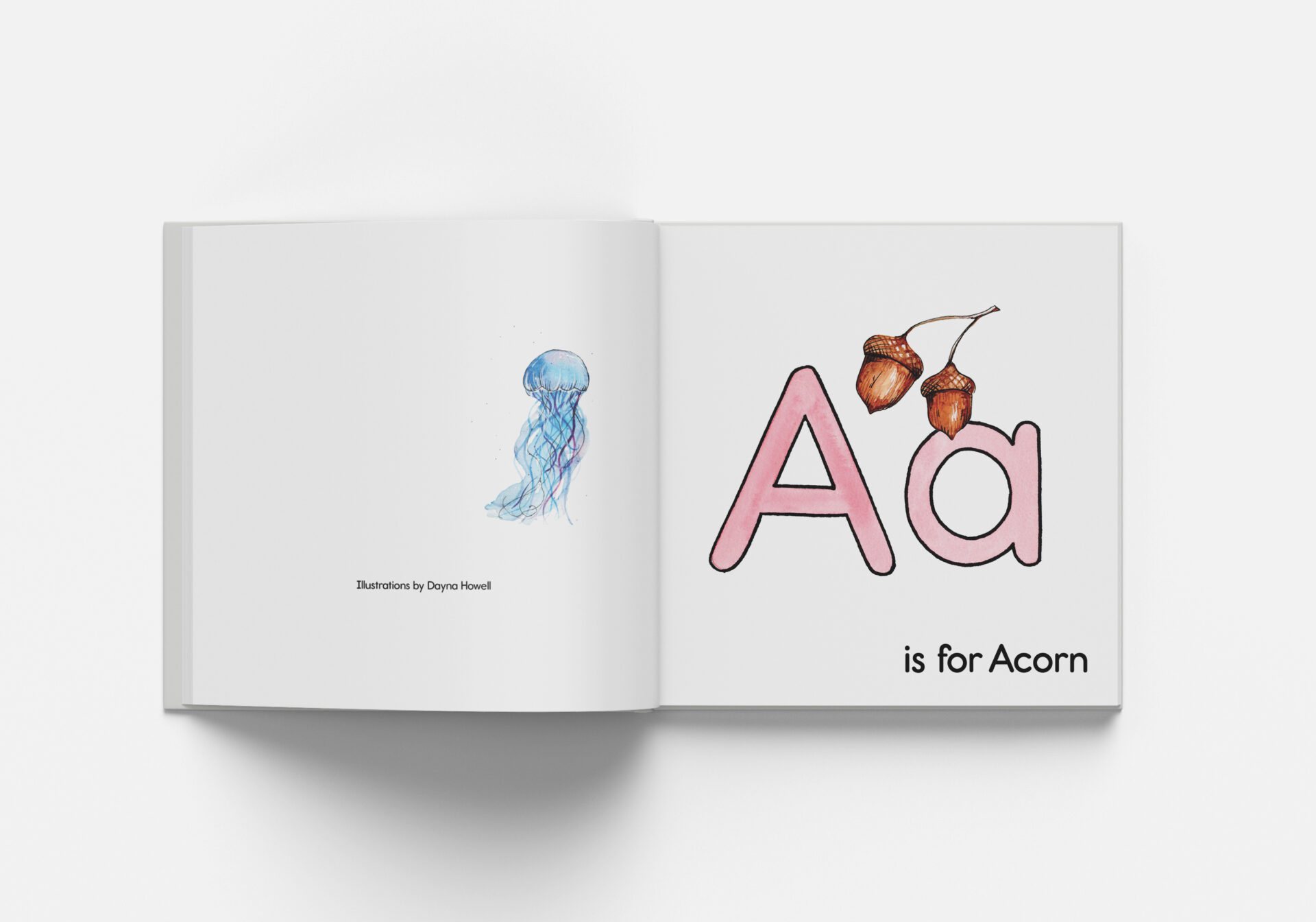
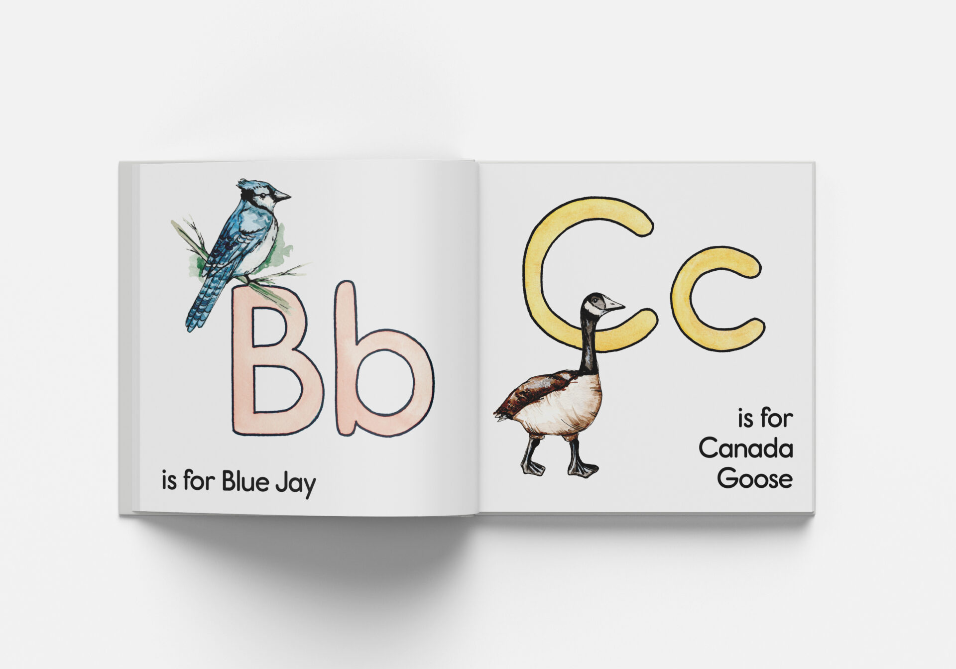
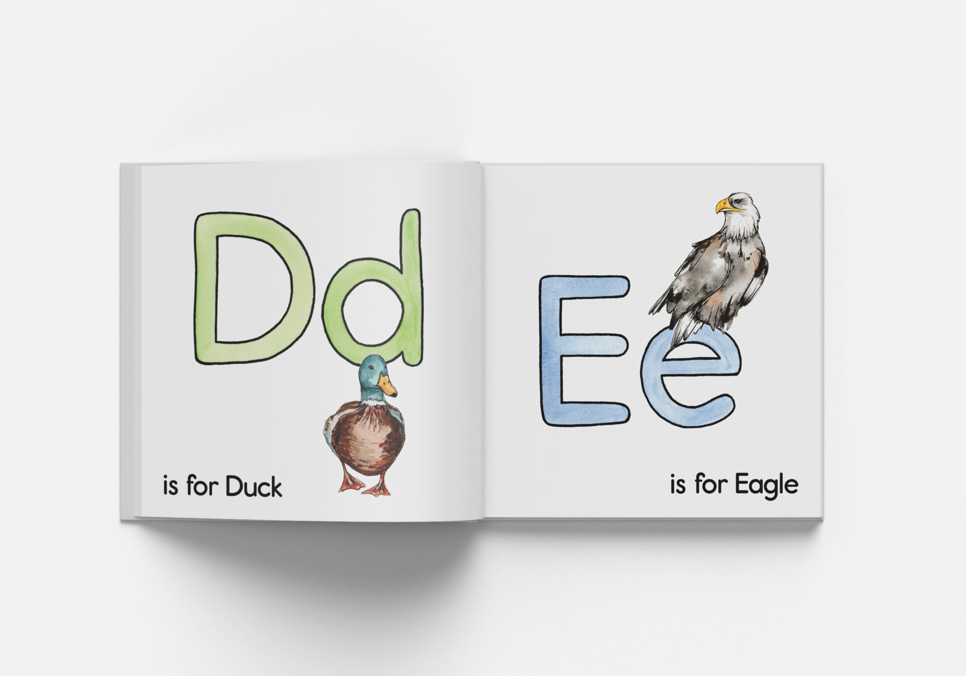
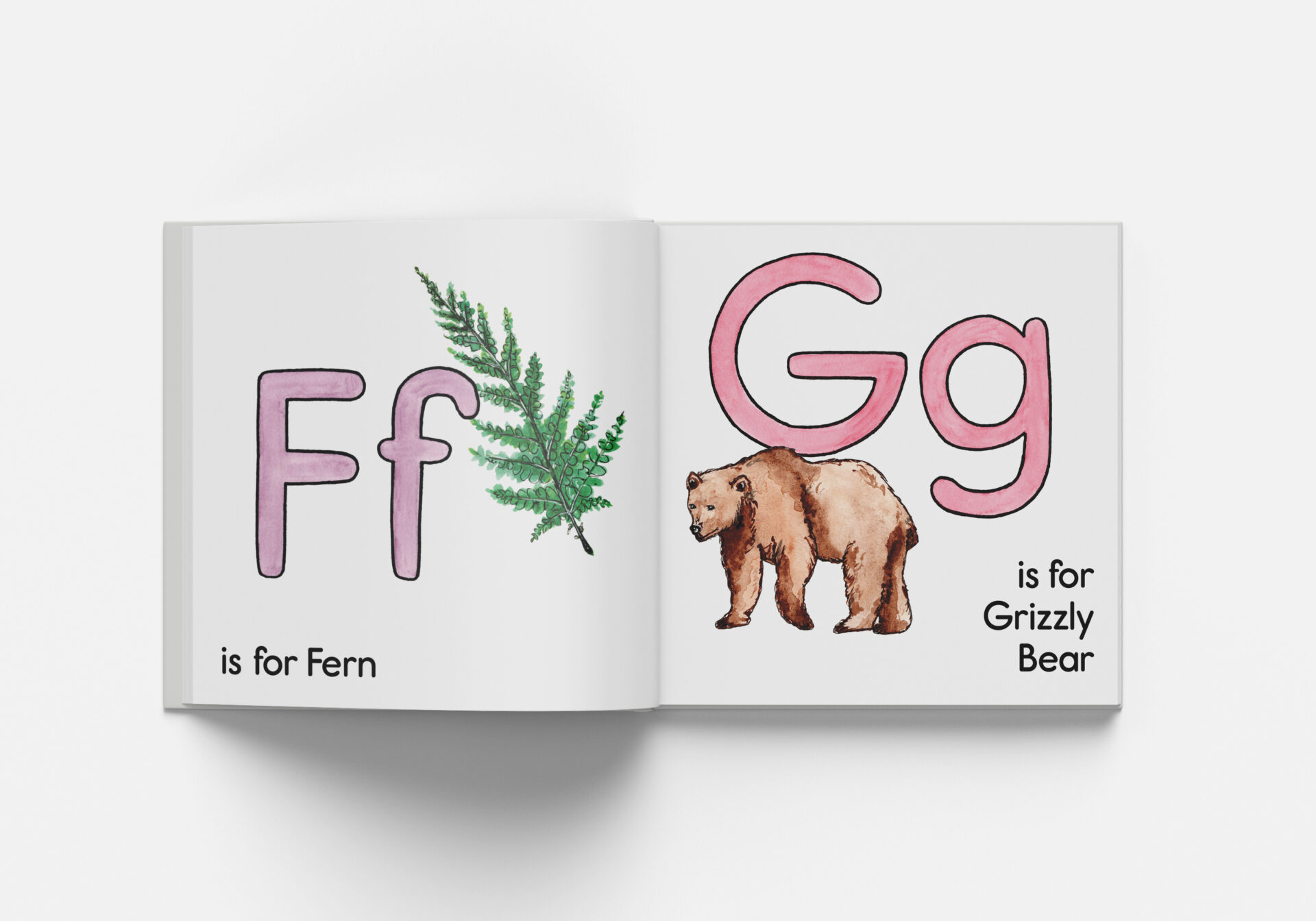
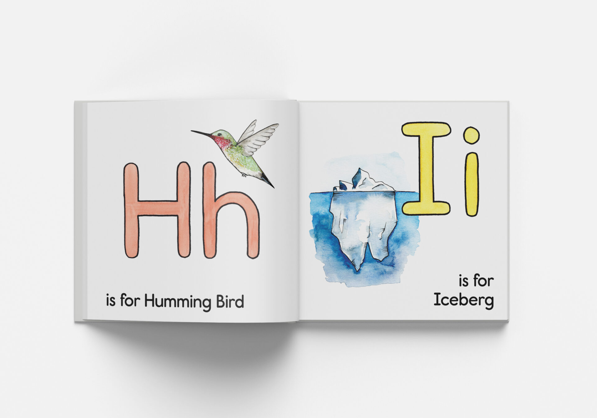
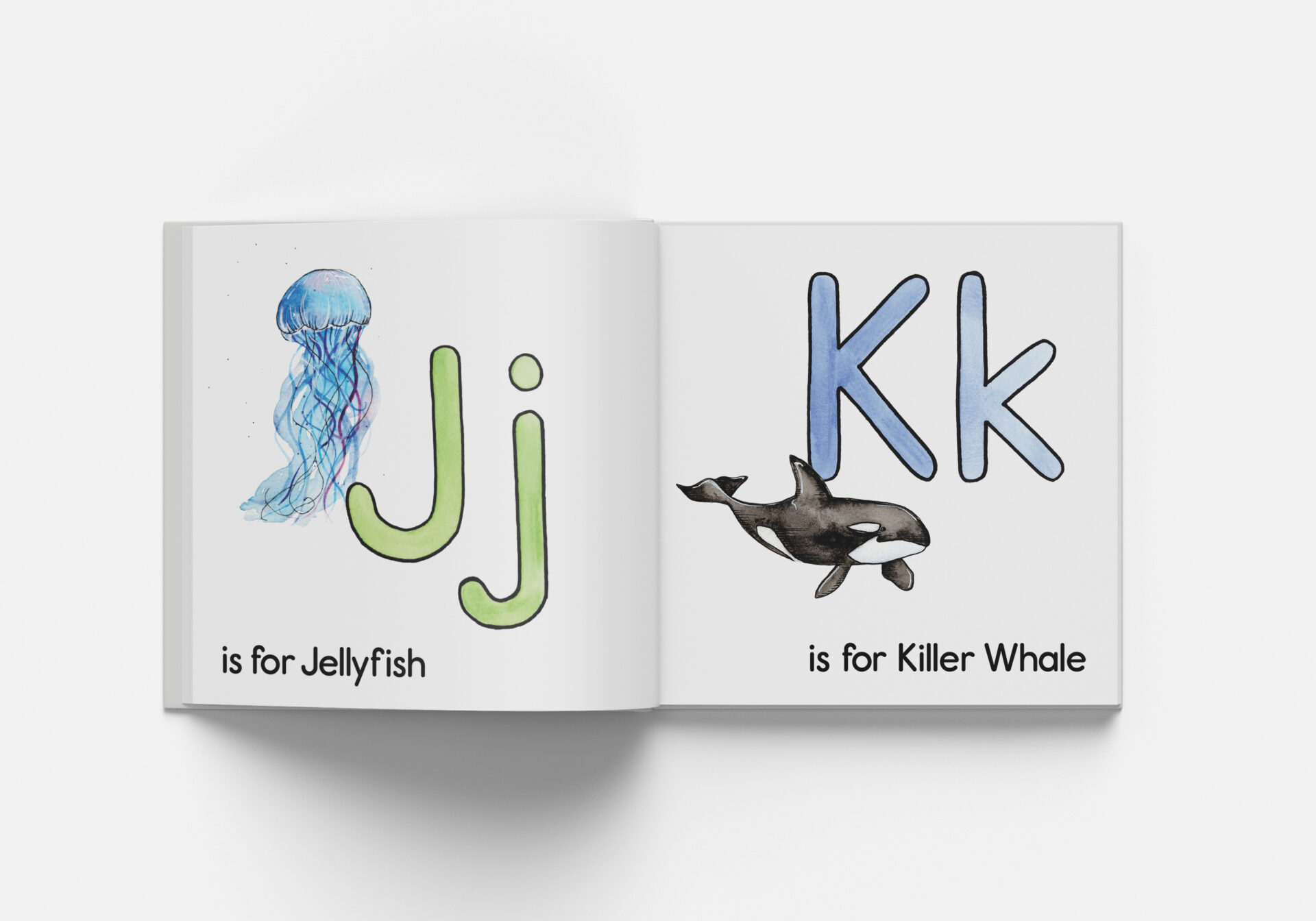
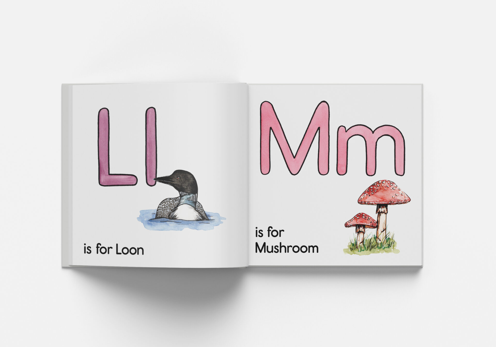
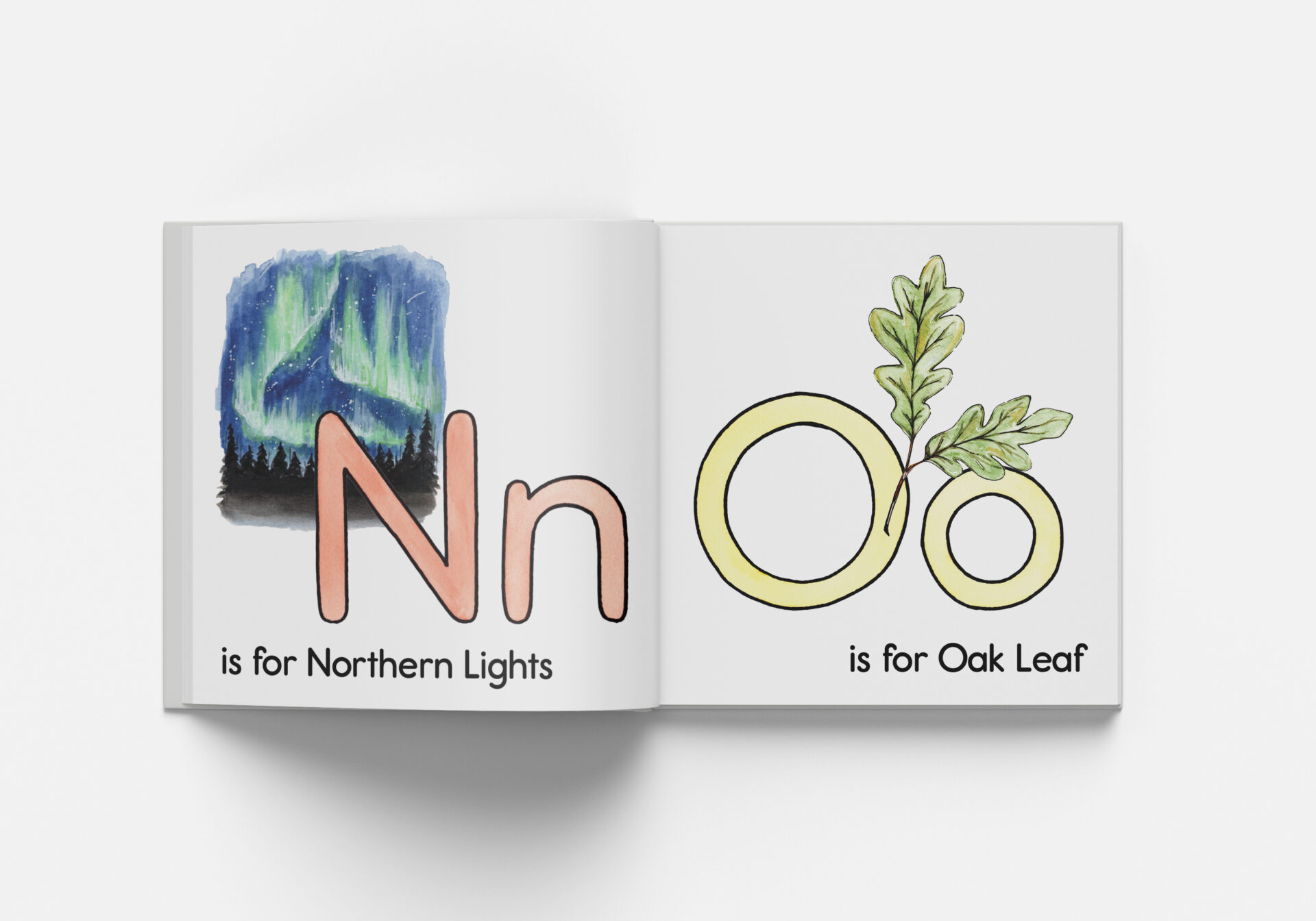
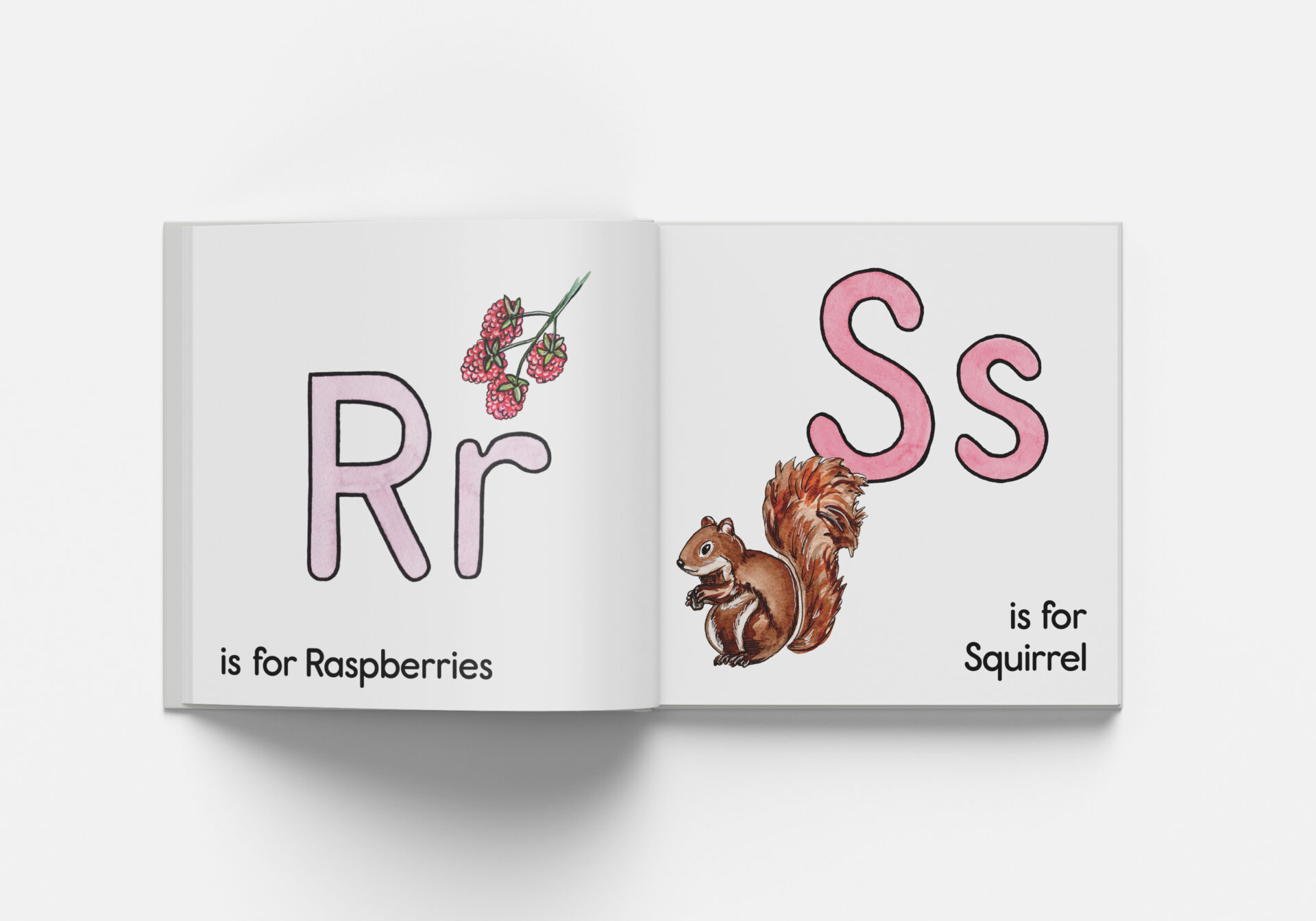
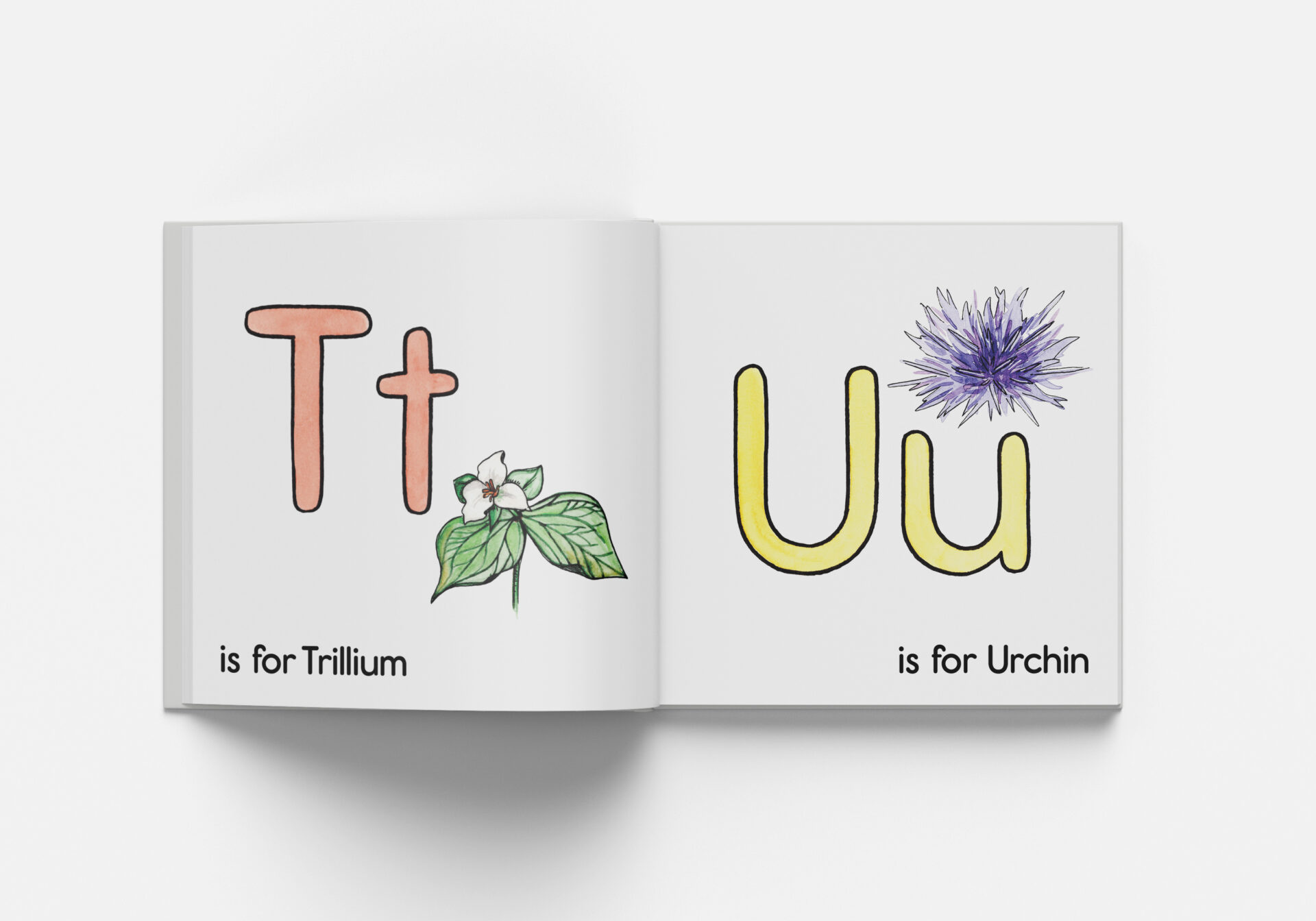
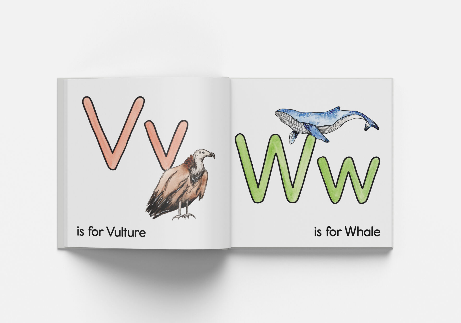
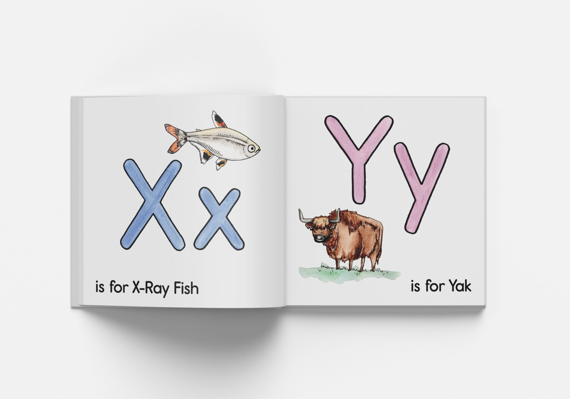
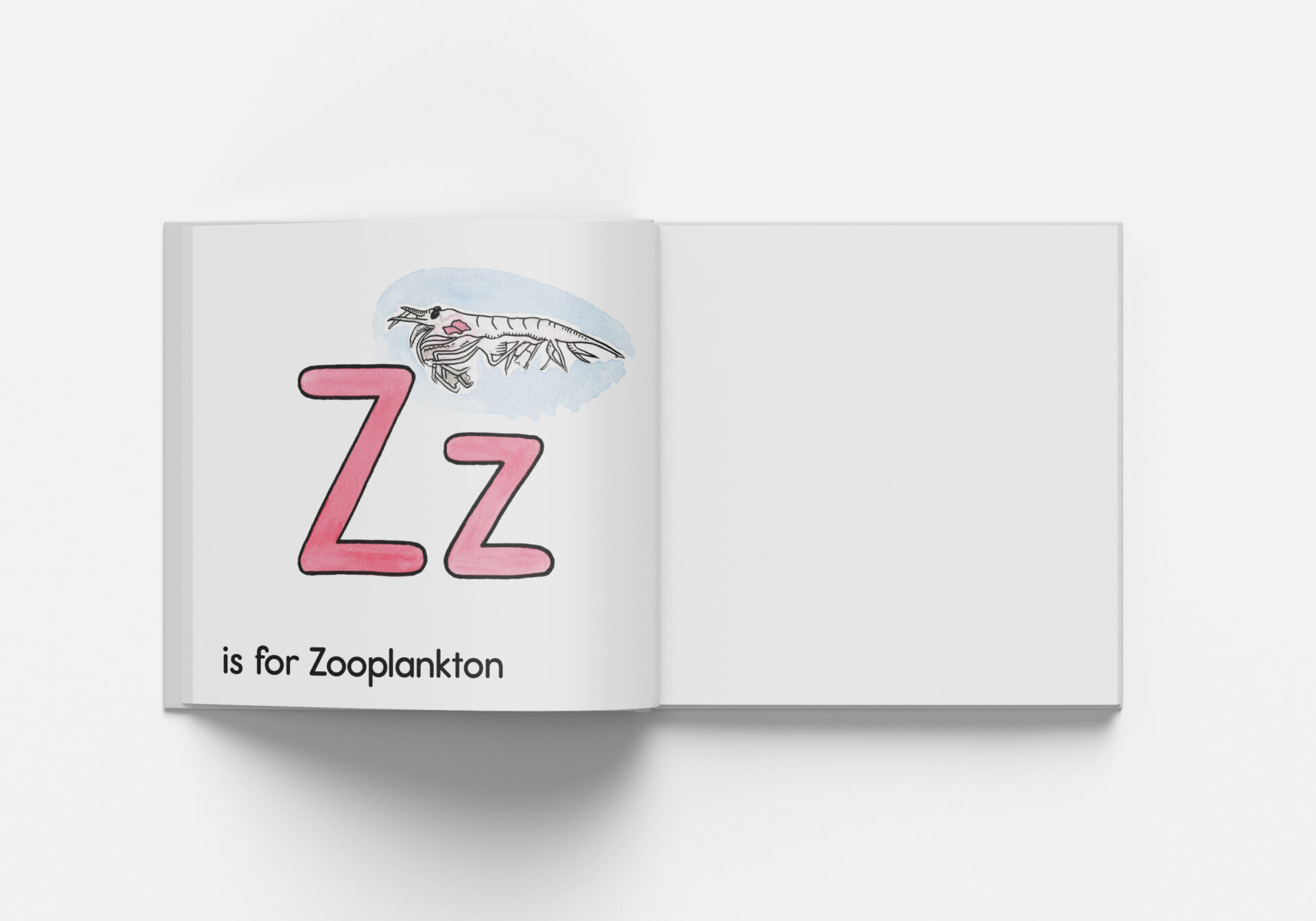
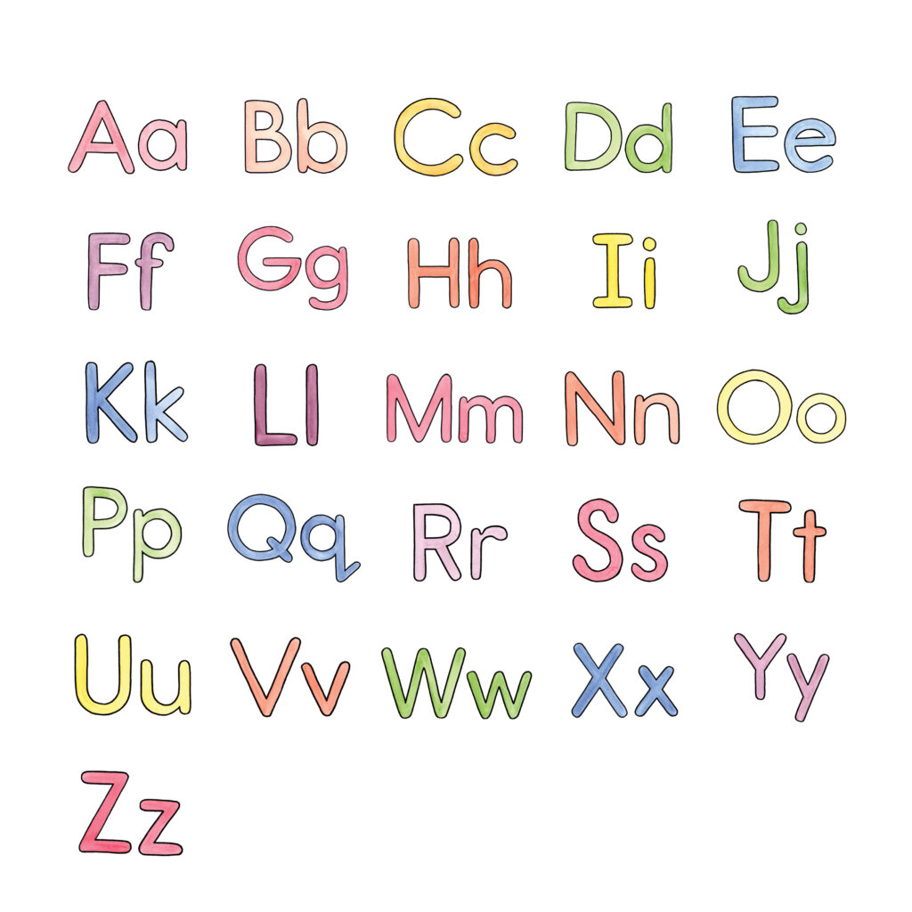
The primary focus for this design was to ensure readability and legibility, especially for children. I chose Adobe’s Report SemiBold for its easy to distinguish capital and lower case letters. The sans-serif font has clearly recognizable letterforms for children learning the alphabet with no distractions or possible confusion from serifs.
Each page is laid out so the letters are large and easy to identify by the children using the book. The illustrations compliment each letter by providing the audience with a nature-focused example of a word that starts with each letter. Finally, the clear and minimal use of body copy on each page ties together the letter and illustration, keeping the pages simple and informative.
I chose a rainbow colour palette for this design because it is bright, fun and draws the attention of children. The rainbow colour palette is somewhat muted through the use of watercolour paint, allowing the illustrations to be colourful while still appearing friendly and calm.
All mockups from www.freepik.com